The Academy’s School of Graphic Design has long been recognized for its expertise in packaging design, and for graduating many students employed at top studios, manufacturers and corporations. Global powerhouse website Packaging of the World has most recently featured the work of a number of current students and recent alumni of the graphic design school.
The latest to step into the spotlight include Xiaoxiao Ma, Sheraya Amaratunge, Sitong Yu, Taisiya Teslya, Yaling Li, Yumeng Tian and Sheraya Amaratunge—all BFA candidates and graduates.
Here’s a look at the compelling designs and the individuals who created them, as celebrated in Packaging of the World.
HAY Glass
HAY is known for offering Danish-inspired furniture and housewares. For her student project, Xiaoxiao Ma (2019 BFA) chose to create packaging for HAY’s can-shaped glass, which she describes as a nod to beer containers or classic soda glasses.

“The clear glass with an inverted lip is a fun way to serve beer, juice, soda and cocktails,” she says. For packaging the glasses, Ma chose thin (1/16th-inch) corrugated E-flute cardboard.
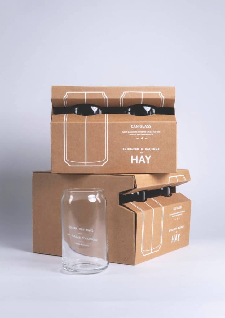
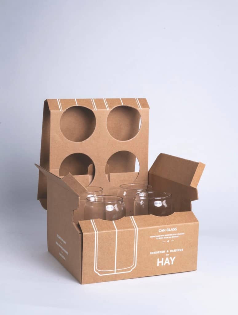
Ma’s approach emphasized packaging that functions efficiently and is sustainable and “mindfully constructed,” she says. She chose the E-flute corrugated material because it’s an excellent source of fiber for recycling.
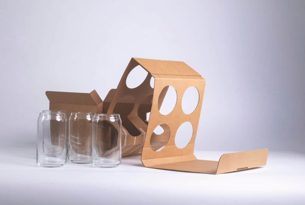
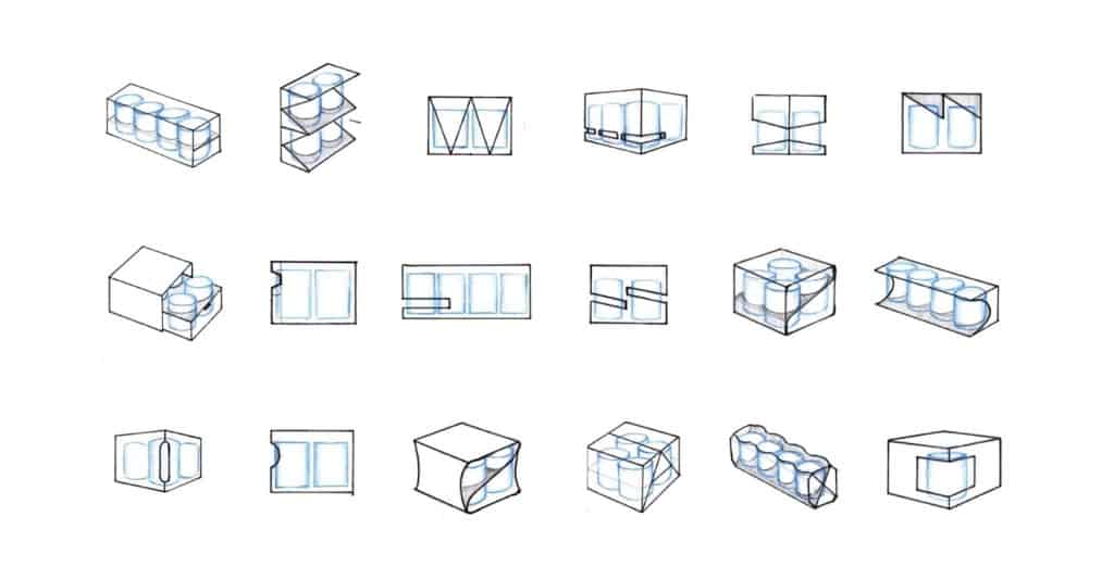
The project was created for Undergraduate Associate Director Tom McNulty’s “Package Design 2: Executing 3D Design” class.
Catan Urbanite Board Game
For graphic design instructor Christine George’s “Package Design 3: Advanced 3D Branding” class, Xiaoxiao Ma created an altogether new version of the Catan board game that she calls “Urbanite.”
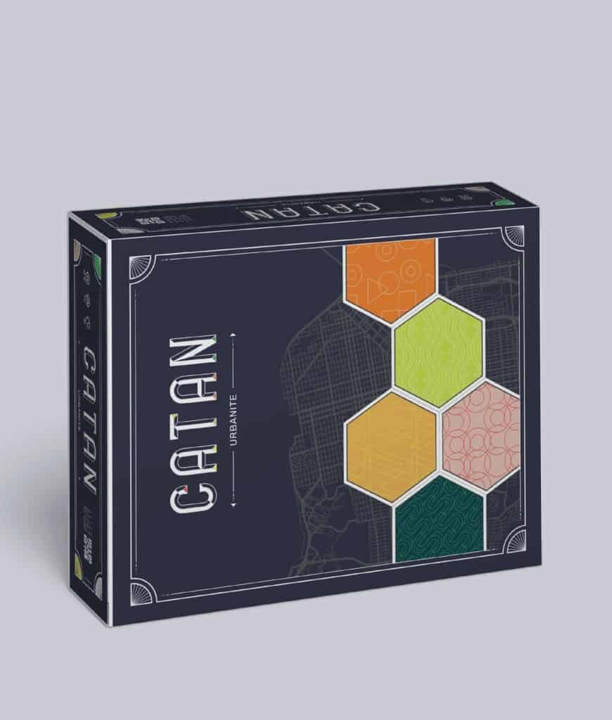
Catan is a globally popular game created by German designer Klaus Teuber. It’s been part of the gaming and entertainment industry for over two decades, explains Ma, and it comes with an array of extensions, spin-offs, editions and expansions. Available in more than 39 languages, it has sold more than 27 million units worldwide since 1995.
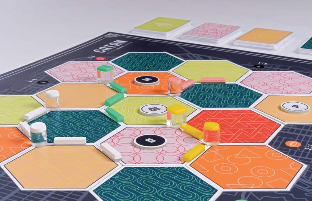
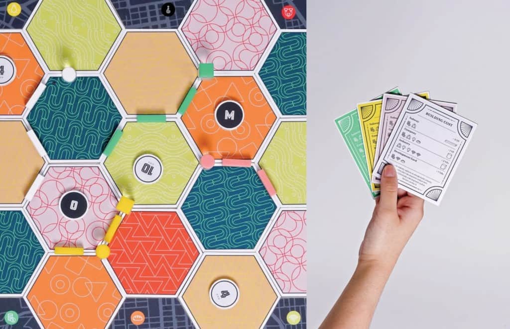
“Approximately 20 million people spend time in the Catan universe on a regular basis,” says Ma. In developing her new version, Ma’s goal was to maintain Teuber’s vision to build a vast community and attract untapped younger audiences.
The game allows players to explore a new city together. “The vibrant color palette adds more excitement. The various urban sources evoke connection and empathy,” according to Ma.
She incorporated materials such as laser-printed gloss paper, cardboard and acrylic.
Mindré Retail Store
For McNulty’s “GR 426 01: Package Design 4” class, a group of recently graduated students assembled a multifaceted branding project for a retail store they called Mindré. The project included an array of food packages, environmental graphics and an identity system.


It was created by former students Sitong Yu, Taisiya Teslya, Xiaoxiao Ma, Yaling Li and Yumeng Tian.

The participants envisioned Mindré as a retail store for consumers who care about ethics and transparency in business. “Mindré provides products that are sustainably produced and made with 100% natural materials,” state the designers. “Its products are highly durable and functional, without compromising beautiful design. Mindré makes quality and sustainability accessible to every person who cares.”

For this group project, the participants developed four sub-brands for the store: food, kitchen, kids and beauty/wellness. “We designed packaging for various categories within each of the brands,” say the team members. “We worked closely together to make sure there were enough variations within each brand.”
Citron Cider Packaging
In current graphic design student Sheraya Amaratunge’s envisioning, Citron Cider is a high-end product from Oregon with a strong reputation among cider aficionados. For her student project in Christine George’s “Packaging Design 3” class, Amaratunge chose to portray the product’s image as one with “a good reputation when it comes to what’s inside the bottle, but what’s on the outside is what needs a change,” she says.
The changes Amaratunge created include both the beverage’s carton and the cans it holds.

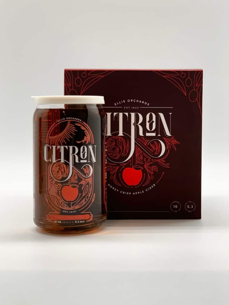
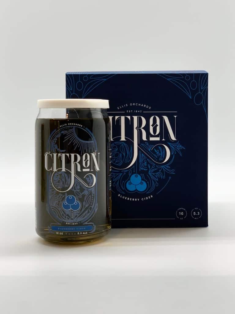
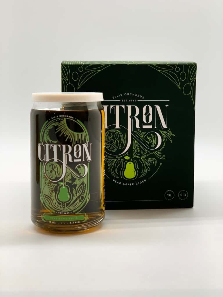
“What makes this packaging unique is that the main product is a glass can, which can be reused, with reusable 3D-printed lids,” she says. “The rubdown print on the glass makes the product look very high-end and worth keeping after the primary use of the glass.”
Amaratunge has also built an origin story into the packaging. “The illustrations for this project were inspired by the story behind a cidery, Ellis Orchards,” she says.
The story is about Charles Ellis, an American author. Ellis was a man of the world who fell in love with a Kazakhstani farmer’s daughter. “The farmer gave Charles his daughter’s dowry in apple seeds, which led Charles to open his own orchard, Ellis Orchards. Throughout the packaging design, you see little hints of the story incorporated in the design.”